

Wednesday, 28 December 2011
Thursday, 1 December 2011
Rio 2016 Paralympic Games logo launched
The new logo for the Paralympic games in Rio.
I like the fluid motion and simplicity, I also admire the main games logo.

Stormy days ahead!
A extraordinary and simple idea for those winter cold days camping.
I love the natural and direct approach. I will have to buy some just to impress my friends!

Wednesday, 26 October 2011
The tree of life chapel
The tree of Life chapel in Braga, Portugal, a beautiful building adorned in wood designed by architects António Jorge Cerejeira Fontes and André Cerejeira Fontes, with sculptural work by sculptor Asbjörn Andresen. Definitely an amazing place to worship.
See it on this cool site.

See it on this cool site.
Monday, 24 October 2011
Some of Britain's coolest brands
Some of Britain's coolest brands, which are your favourites?. Mine of course is Apple, and I rather like Morgan cars especially the video.

I FLY MAGAZINE
I FLY web site with full-screen video and photography and an intuitive iconic navigation are coupled with stories about travel for this multimedia on-line magazine. It makes you want to take off and explore!

Friday, 21 October 2011
The Shard
The Shard in London will be the tallest building in Europe, a fantastic landmark designed by the Italian architect Renzo Piano. To me it seems like a huge crystal from the Superman movie or something placed there by the god Zeus!
The entire building will be clad in glass and there will be a viewing gallery on the 72nd floor where the views over the London skyline will be magnificent no doubt.

Thursday, 20 October 2011
The new EDP logo

Brandingsource
I wasn't sure I liked the new EDP logo, but now after seeing it work in various locations like the Lisbon trams etc. I like it. It was designed by Sagmeister, it is very stimulating and stands out from the crowd. It works very well in the different permutations (animation), well done Stefan.
Brandingsource
The new British Gas logo is a letdown
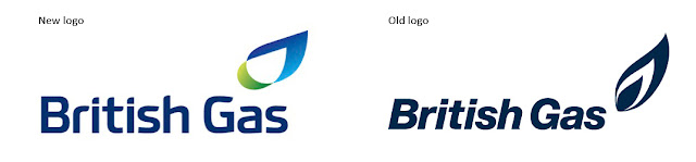 Is this a new logo or a restyling?, I don't think this is a sign of the future, but more of a sign of the past!, a missed opportunity to communicate something different.
see CR blog
see CR blog
Subscribe to:
Posts (Atom)